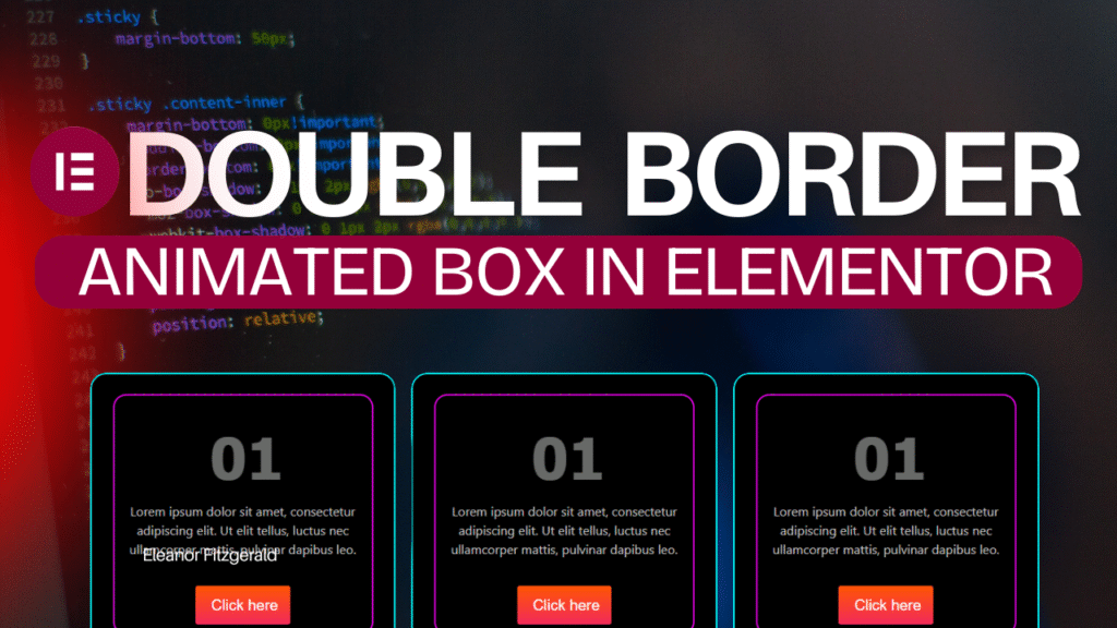
Want to give your Elementor boxes or buttons a modern, glowing double border animation? In this tutorial, you’ll learn how to create a Double Border Animated Box using simple CSS inside Elementor.
No plugins, no coding experience required — just follow along!
🎬 What You’ll Learn
- How to create a stunning double border animation in Elementor
- How to apply hover effects using CSS pseudo-elements
- How to add a soft glow animation for a modern design look
🧱 Step 1: Create a Box in Elementor
- Open your Elementor Editor
- Add a Section → Inner Section → Column → Box (or Button)
- Customize your text and background color
- Go to the Advanced Tab → Custom CSS (available in Elementor Pro)
💻 Step 2: Add the CSS Code
Copy and paste the following CSS code into the Custom CSS area:
selector {
  position: relative;
  background: #000;
  color: #fff;
  padding: 40px;
  text-align: center;
  border-radius: 20px;
  overflow: hidden;
  z-index: 1;
}

selector::before,
selector::after {
  content: "";
  position: absolute;
  top: 0;
  left: 0;
  width: 100%;
  height: 100%;
  border: 2px solid #00ffff;
  border-radius: 20px;
  box-sizing: border-box;
  transition: 0.6s;
}

selector::after {
  border-color: #ff00ff;
  transform: scale(0.85);
  transition-delay: 0.1s;
}

selector:hover::before {
  transform: rotate(5deg) scale(1.05);
  border-color: #00ffff;
}

selector:hover::after {
  transform: rotate(-5deg) scale(1);
  border-color: #ff00ff;
}
